Placed Students
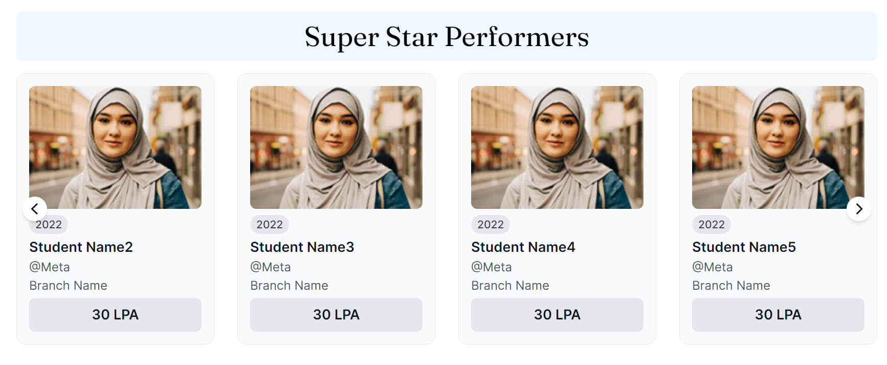
The Students Placed page displays information about the students who secured placements in renowned companies and bagged a good package. This section is categorized into Super Star Performers, Star Performers and All Star Performers.
- Super Star Performers: Displays Students who have performed exceptionally well throughout the years.
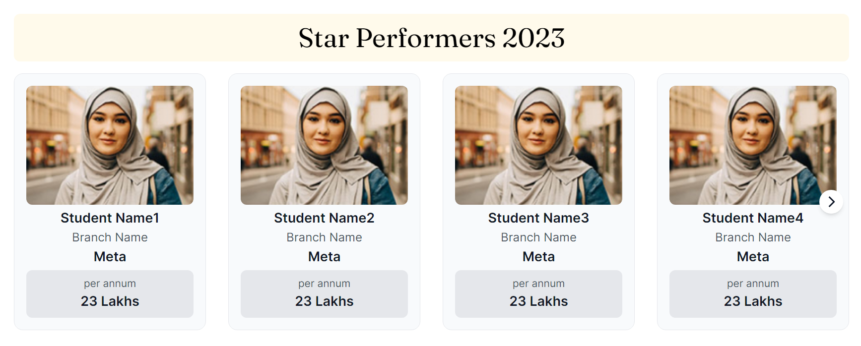
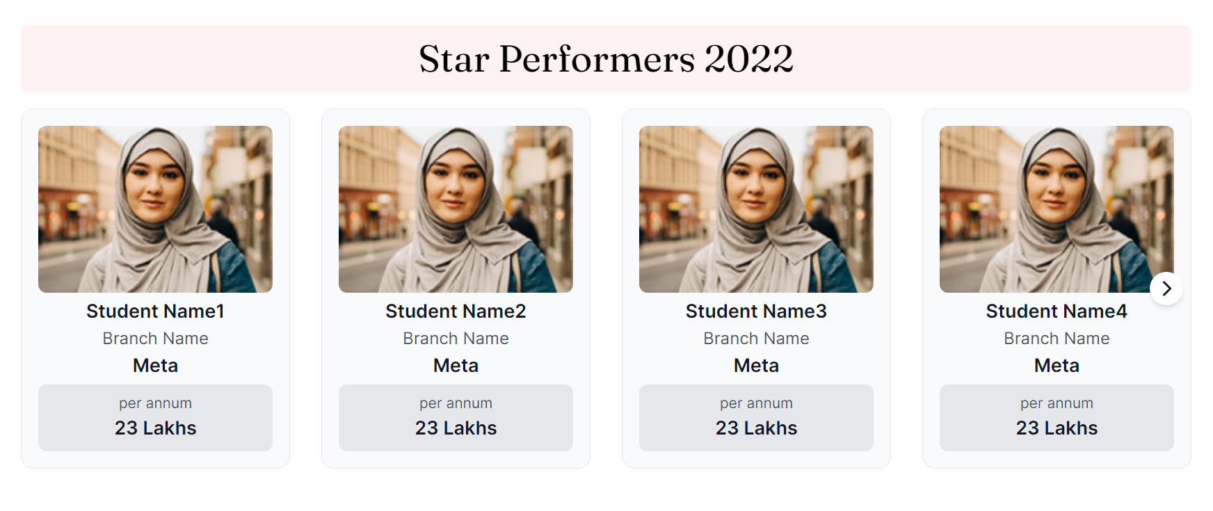
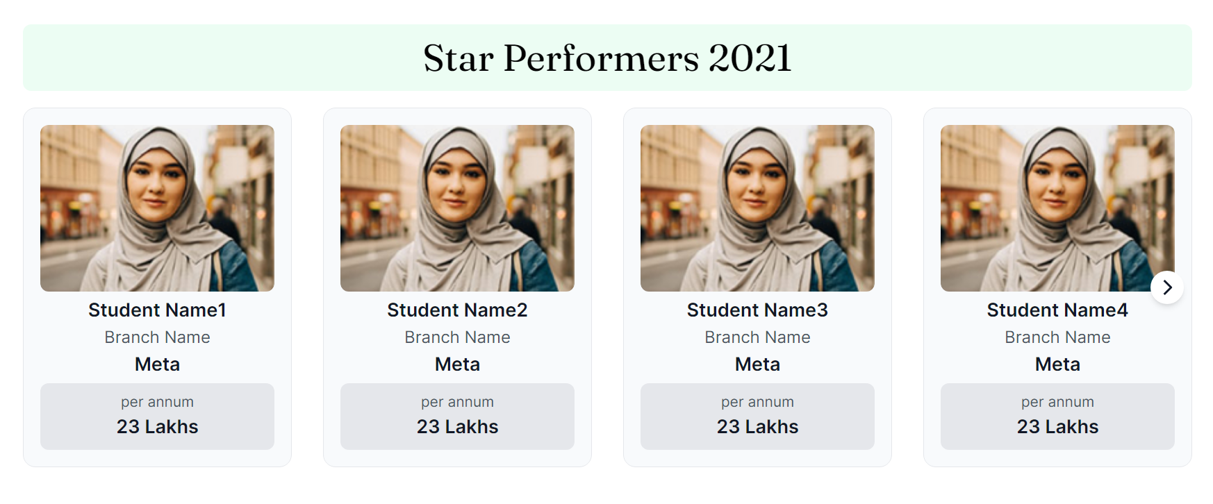
- Star Performers: Displays top students from each academic year (2019-2023) who have performed well.
- All Star Performers: A list of pdfs with all the top performers from each year.
Super Star Performers
To create a carousel of cards with the information about the Super Star Performers of TCET, we need to create a functional
component SuperStarPerformers.
Here's what we did:
Open "SuperStarPerformers.tsx" file.
"SuperStarPerformers" component is created. This component returns
<SwiperSlide>component to create slides for each performer. Within the<div>element information such as image, batch, name, company, branch and package will be displayed.
This is how we displayed the image of the student:
    <div className="min-w-full">
        <img
            className="rounded-lg w-full h-40 object-cover"
            src={superStarPerformer.img}
            alt="Super Star Performer Photo"
        />
    </div>
Batch of the student:
    <div className="mt-2">
        <span className="text-sm font-medium px-2 py-1 rounded-full bg-gray-200 text-gray-700">
                {superStarPerformer.batch}
        </span>
    </div>
In the same way, we displayed name, company, branch and package information of the students in SuperStarPerformers.tsx.
- This component also returns a
<swiper>component which represents the main container and defines the overall behaviour of the carousal. It is configured with various props.'breakpoints'is a prop defined that denotes the change in the number of slides based on the width of the screen.
     <Swiper
        //swiper modules
        breakpoints={{
            450: {
                slidesPerView: 2,
                },
            768: {
                slidesPerView: 3,
                },
            1024: {
                slidesPerView: 4,
                },
            1280: {
                slidesPerView: 5,
                },
        }}
        //swiper modules
        >
        </Swiper>
'navigation'prop specifies navigation elements and their associated classes. The elements with these classes will identify as either previous button or next button.
     <Swiper
        //swiper modules
        navigation={{
          prevEl: ".swiper-prev", //previous button.
          nextEl: ".swiper-next", //next button.
          disabledClass: "swiper-button-disabled",
        }}
        //swiper modules
    >
    </Swiper>
Star Performers
This section is similar to Super Star Performers section, where star achievers are displayed batch wise. For each batch a separate carousel is created.
For this starPerformers array is created which contains information about different batches of students
and their placement data. Each batch has a property batch , color associated with it and an array of data
containing information about individual students.
    const starPerformers = [
        {
            batch: 2023,
            color: "#FFFAEB",
            data: [
                {
                    img: "/studentPlaced/student_image.jpg",
                    name: "Student Name1",
                    branch: "Branch Name",
                    company: "Meta",
                    package: "23 Lakhs",
                },
                // Other student objects...
            ],
        },
        // Other batch objects...
    ];
StarPerformers component is rendered for the corresponding data for each batch as we saw in Super Star Performers.
All Star Performers
This section contains downloadable links of pdf containing information about all the star performers from each batch.
Each container is a <button> which contains an svg icon and anchor tag linking to a pdf that can be
downloaded upon mouse click.
    <button>
    <span class="font-title text-lg">
            <a href={item.link} download>
              {item.batch} PDF
            </a>
    </span>
    </button>
To create svg icon for each batch, refer: index.astro
This is how different sections of the page looks like:
- Super Star Performers
- Star Performers 2023
- Star Performers 2022
- Star Performers 2021
- Star Performers 2020
- Star Performers 2019
- All Star Performers
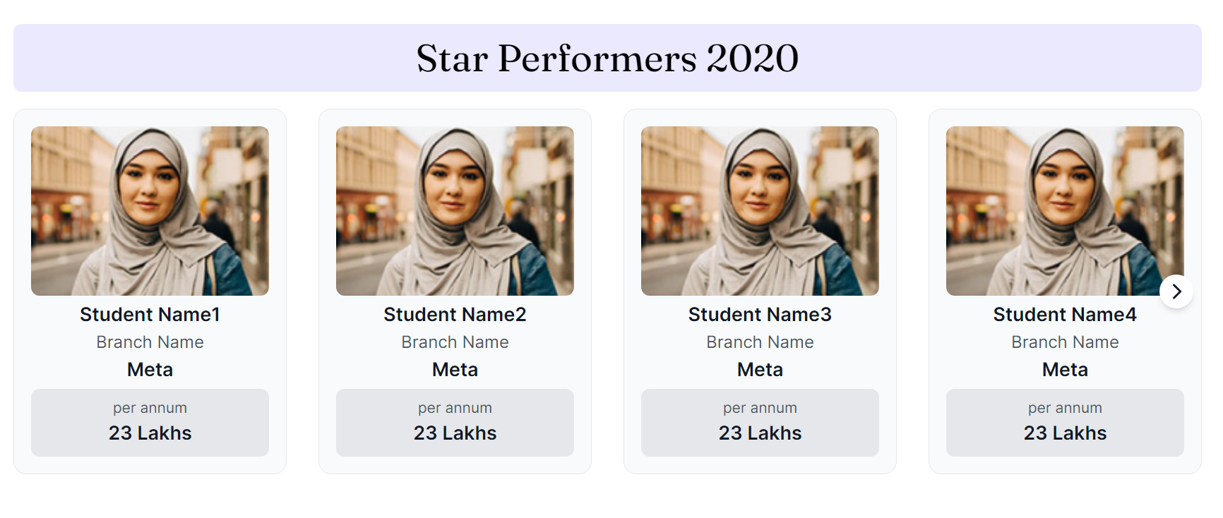
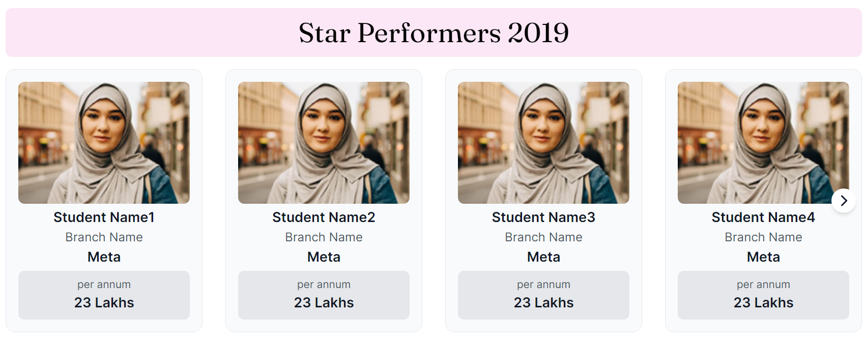

In this section, we saw how we created Placed Students page. Let's see how we implemented Student Awards page in the next section!